

(category)GENARAL
Market Drawdowns: Where We Stand & What History Tells Us in 4 Charts
India Stock Market Drawdowns: Where We Stand & What History Tells Us in 4 Charts.
Anoop Vijaykumar•
📉 [Chart 1] The median NSE stock is down 43% from its peak. Painful? Absolutely. But historically, it's been even worse in about half of similar periods.

📊 [Chart 2] What's next? Current conditions suggest a +6% return over the next year. But don't get too comfortable - historical ranges span from -50% to +65%. We're far from the point where positive returns are a near-certainty.

🔍 [Chart 3] A closer look at forward returns by drawdown decile puts us in a delicate position: markets typically either recover quickly from here or deteriorate significantly before eventually rebounding.

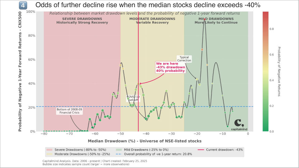
❓ [Chart 4] Are we near the bottom? What are the odds your investment today will be negative a year from now?

Our analysis of NSE-listed companies shows:
1. 20.8% overall probability of negative 1-year returns historically
2. Counter-intuitively, highest risk (70-80% probability of losses)
occurs when markets are only 15-20% down
3. Once stocks fall >60%, forward 1-year returns have historically
always been positive
4. We're currently at a -43% median drawdown with a 40% probability of
further decline
5. The -40% to -50% zone we're entering shows a significant probability
spike of continued losses
🔑 Key takeaway: Historical patterns suggest we might see more pain before recovery begins.
Note: The list of investors who've called market bottoms correctly throughout history remains stubbornly empty.
